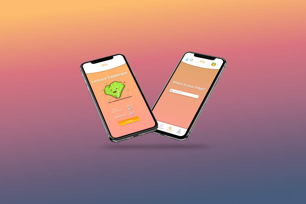
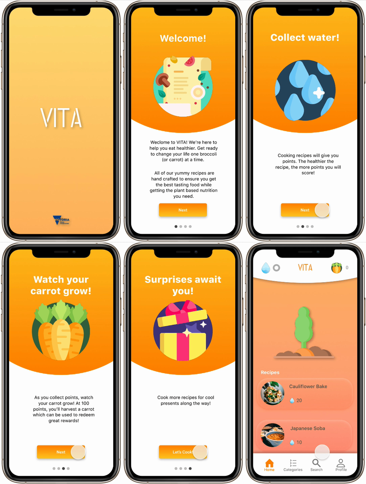
Leveraging behavioural science research, we created a mobile app that helps people eat better.
Although our expected deliverable was a mid-fi prototype, I decided to block out an afternoon and came up with this interactive prototype after the sprint.
Introduction
VITA, a not-for-profit organisation, currently treats numerous chronic condition cases by changing people’s lives through diet.
However, VITA believes that disease prevention is better than a cure. They are inspired to:
“Use behavioural science to help people change their habits, improve their health and reduce their risk of chronic disease”
I was part of an ambitious project, representing VITA to help people achieve fuller lives through positive behavioural changes using a digital platform.
The Challenge
With recent funding from VicHealth, VITA wants to scale by promoting sustainable lifestyle changes.
“VITA wants to scale their program to effectively introduce the benefits of a plant-based diet into the lives of the broader public”
Goals
Approach
Market research
Surveys
User interviews
Affinity mapping
User personas
Journey maps
Crazy8s
Feature prioritisation (impact vs effort)
Task flow
User flow
Paper prototyping
Figma
Role
My major contributions:
Australian trends research
User interviews
Personas
Journey Map
User flow
Sketching / lo-fi prototype
Figma prototype
Timeline: 2 weeks
Platform: Mobile app
Team: Jasmine Cheng (Me), Kelvin Ng, Oscar Bitton, Eden Taylor-Wineera
Introduction to the Solution
In line with Behavioural Science recommendations, we created a solution to educate and build user confidence by gamifying the user journey.
This mobile application includes healthy plant-based recipes that are over 60% veggie-based, taken from the current IRL program and backed by both the Victoria government and health authority. There are also features such as short quizzes, and a point system with rewards to guide users to a positive change in their diet.
The Process — We focused on 4 phases of market research
+ Target market
Why? —
- To make sure we are building for the right people
- To guide the decisions we make around the project
Insights —
- Younger audiences are more receptive to change
- It is easier for millenials to pick up new technologies compared to previous generations
+ Plant-based diets
Why? —
- To make sure we are providing trustable sources
- To set a standard based on the government health authority
Insights —
- Flexitarian diets are the best due to their low risk of facing health-related complications
- People have the freedom of incorporating small amounts of animal and dairy products, reducing their dependency on supplements.
+ Australian trends
Why? —
- To deep dive into the current problems
- To understand what’s most effective for MVP
Insights —
In 2017–2018, 92% of Australians did not consume the recommended 5-6 servings of vegetables every day
+ Behavioural science
Why? —
- Explore ways to effectively change and sustainably maintain eating habits
- To understand how habits could be formed through the usage of a mobile app
Insights —
“A learned sequence of acts that have become automatic, unconscious responses to specific cues and triggers”
Surveys and user interviews
Based on habit-forming research, we simultaneously ran a survey and conducted user interviews to collect both quantitative and qualitative data.
We received 150+ survey responses and interviewed 25+ people in the process of collecting data.
Age distribution for people who conducted surveys (left) and user interviews (right)
Synthesising research — What we found
From the above research, we found that:
People are confused due to contradictory information out there
Social aspect of food is important as it is a way to connect with people
Eating pure vegetables might lead to complications like iron inefficiency
There are 6 key steps to sustain behavioural change
Make it easy
Taking small steps
Building upon previous steps
Practice and repetition
Small rewards
Building motivation through visible progress
The Persona
Journey Map—Empathising with the Persona
Based on our persona Riley, we created a journey map to explore opportunities.
There was a significant difference around lunch, with higher energy and less hunger due to a fuller diet. The only noticeable downturn was around dinner.
The downturn is due to the unfamiliarity with healthy recipes, resulting in confusion on what to purchase and frustration at lack of variety and taste.
Problem Statement
“Riley needs to take the difficulty out of processing (learning) how to eat healthy so they can easily cook & eat healthy meals”
We then selected three different angles we planned to attack the problem from.
Educate about healthy eating
Make eating healthy meals enjoyable to learn
Make learning simple instead of complicated
Design Iterations
After a series of ideation exercises (Crazy8s, Impact vs Effort), we prioritised the key features:
Task flow and user flow
Why? —
To identify major navigational paths, and understanding how the users’ surroundings can influence decisions.
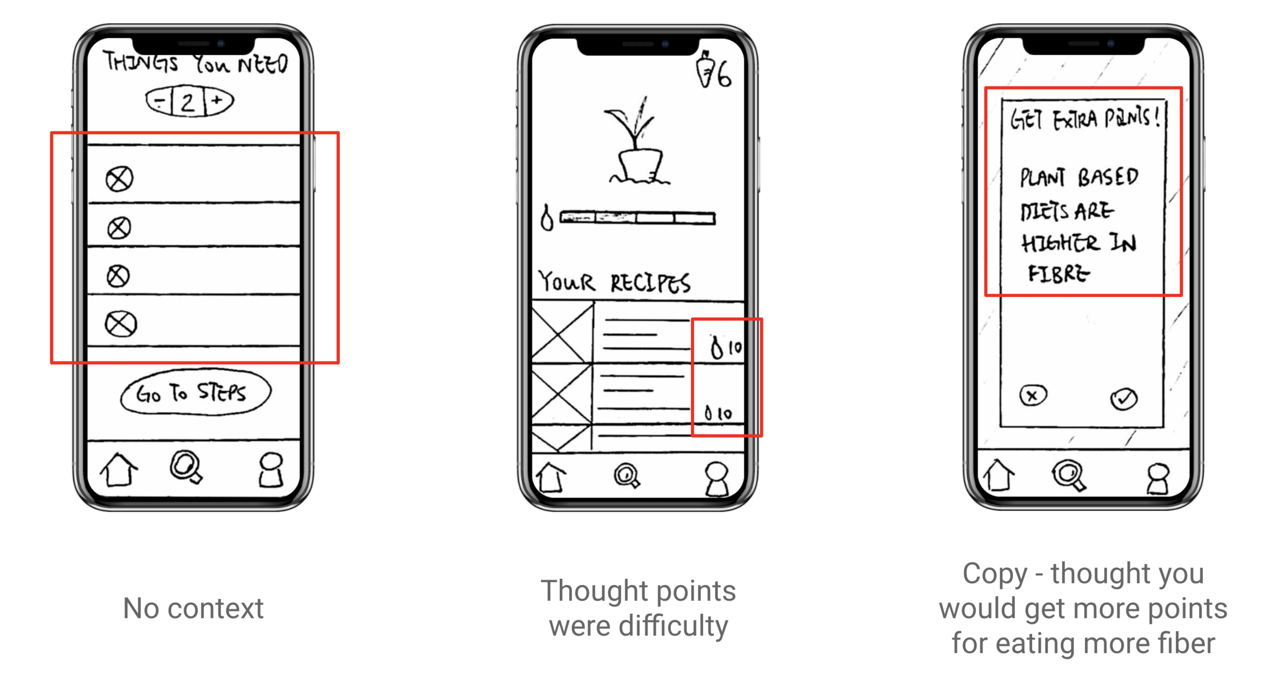
We tested paper prototypes on users!
We decided to conduct an unmoderated test for our first usability test to examine the feasibility of the wireflow.
We focused on gauging how well a user could perform the fundamental task of choosing and executing a recipe.
There were three main feedbacks to iterate
A lot of issues came from the copy, something that would have to be reviewed in the next iteration.
Despite this, most users were still able to complete the task of searching and selecting a recipe from end to end.
Interactive Prototype
Let’s make a Quinoa Pilaf!
Future Steps
Based on user research, these are the future features the team would like to see:
Test the mid-fi prototype to see how users react with more context.
Develop notifications to create consistency and repetition, helping users to solidify their eating habits.
Third-party negotiation with supermarkets and cafes to further develop the in-app currency reward function.
Get friends and family involved to increase engagement.
What I Learnt
1.Your team values you, be confident!
Your communication skills reflect in the product. If you don’t believe in your work, it shows. Don’t be afraid to voice your opinion, own your thoughts and be confident.
2.The beauty of functionality and the functionality of beauty…
Everything in the app should have a reason to exist. “Branding” is not limited to visuals, but rather the feel of the product as users experience it.
3.Why, Why, Why
“Why” is not only a question to the users, but to yourself too. Why do I want this function? Why is this suitable for the users? Why did I choose this process for the usability test? Always link back to your fundamental principles - why did you choose to do UX?
Find this appealing? 🍌
Read my 8 mins of detailed research and process on Medium.
UI Lead/ UX Designer
PM, UX/UI Designer
UX/UI Designer
UX Researcher


